MLB Pace of Game
This year, MLB attempted to shorten the game of baseball by testing new rules during Spring Training. Over the past few years, the game duration had grown increasing long and MLB was concerned with fan engagement. Shortening the game by adjusting current rules could potentially shorten the game and the UX team was asked to design a stand-alone page to explain these new rules to fans.
TIMELINE: 1 WEEK
VISIT: CONCEPT
Three templates
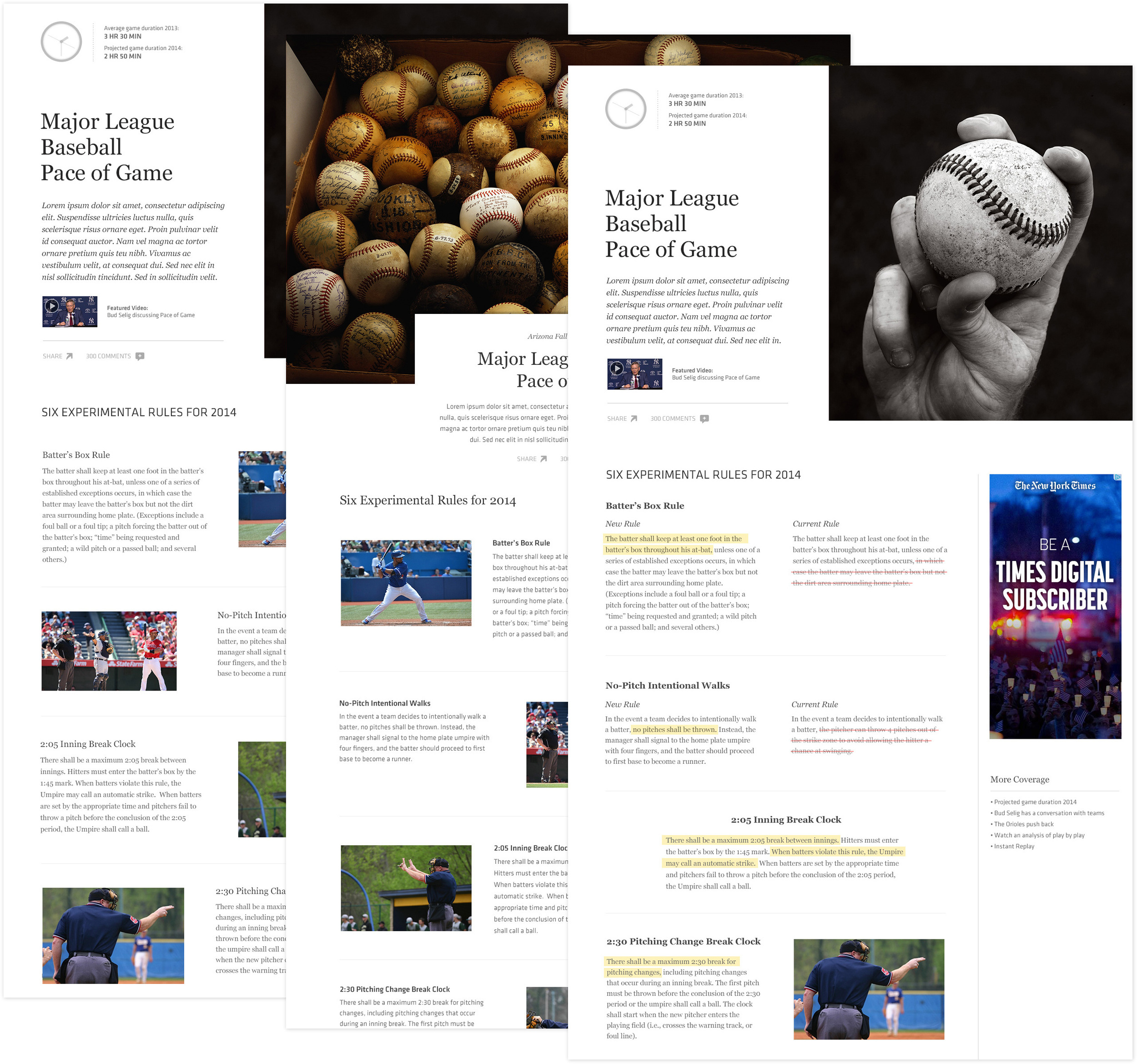
To present these new rules to MLB fans, we wanted to overlay video, images and text representing the reason behind the the changes and what those changes would look like. My three templates were based off showing a graphical clock comparison showing time difference, a video clip explaining the rules and a list of new rules combined with images.
Template A
This template was designed to showcase images of the new changes from Spring Training with a simple text explanation of each rule. This template also had a dual sized header - half showing an image, half showing introductory text, video, and a clock comparison.
Template B
Using a large header image with a floating text box overlaid, this template shifted the focus of the page to the image and drew the user down the page with text on the left and the clock comparison and video on the right.
Template C
In this template I wanted to elevate the template by further elaborating on the the rule changes in the lower section. Visually, I was looking to show a one to one comparison of new rules vs. old rules by highlighting new rules and crossing out old rules. This was an attempt to give historical reference to users.
One Template
The final concept was based on Template A which showed a large header combining, images, video, a short description, social sharing and a graphical clock comparison. The template also showed a simplified body section which gave condensed summaries of the new rule changes combined with images from the field at Spring Training.


