MLB.TV Media Player
With over 1.5 million paid subscribers, the new MLB.TV Media Player allows fans to watch any baseball game, any time. The new player design combines enhanced video, scores, highlights, fantasy and game specific information creating a new way to watch baseball.
MLB.TV a paid subscription allowing you to watch both LIVE and archived Ad-Free games from this season as well as previous seasons. With the exception of existing Blackout rules, a fan can watch his or her team play through the season.
PAID SUBSCRIPTION
Allows you to watch both LIVE and archived Ad-Free games from the current season as well as previous seasons.
FREE GAME OF THE DAY
One preselected sponsored game is available to watch once a day during the Spring Training and the regular season
If we have a product that is usable, why redesign it?
In 2014 the business, technical and products team met to discuss the future of MLB.tv. The player format had not changed much in the last five years and the player could no longer support both the latest browsers, streaming initiatives and the business goals for the next 5 years. Additionally, analytics supported that major features in the player were underutilized or unnoticed by users. The need to re-align the business, technical and user goals into a cohesive package was necessary for the future.
TECHNICAL CONTSTRAINTS
1. Web browser based player
2. Eliminate module overlays over Flash Player
3. Create a flexible template to add future feature requests
BUSINESS NEEDS
1. Enhance features to the player to improve engagement
2. Increasing subscriptions
3. Improved our advertising integration
Multi View Controls
Allows users to watch multiple games in a pip, dual or quad view
Scoreboard
Game Scoreboard sorted by LIVE vs Archived Game showing all the games that were played that day.
Player Controls
The player controls provide users the option to manage the game feed and the video
Global Controls
These controls manage closed captioning, volume, mini mode, fullscreen and preferences
Supporting Features
These features allow users to see relevant data and video based on the game
1.1 Old Player Analysis: the player has had minor interface changes since 2005.
Learning about user behavior and needs
- Our data showed that Browser Support of Internet Explorer was shorting out on users streams at a higher than average rate.
- The engagements of key features through click rates were low if non existent
- Users were predominately launching into Full Screen mode once the player is launched
- What angers fans significantly is game spoilers, whether that be through the video and data not being synced to mobile app alerts to breaks in streaming. This has a negative affect on both the users experience with the product.
QUANTITATIVE DATA
To understand our users we looked at both quantitative and qualitative data. For quantitative data we looked at our analytics including click rates, heat maps, and usage patterns.
QUALITATIVE RESEARCH
We performed ethnographic studies, conducted intense observation at scale by analyzing our audience to discover their pain points through mediums like forums such as reddit, app reviews, customer service complaints, commonly asked questions and social media.
Who are our Users?
CASUAL FANS
Casual fans predominately picked their favorite team to watch and when they launched into the player they would go directly into full screen mode. These users did occasionally engage with additional features in the player particularly highlights but only during commercial breaks.
SUPER FANS
The other segment of users we found, we categorized as super fans due to their high engagement and interest in statistics, fantasy sports, and other games going on around the league. Their interests were broader in scope and more engaged in learning more about what is generally happening in baseball.
PRODUCT GOALS
Improve the interaction design between game data and the video stream
Add more value to both the player through AD revenue as well as increase subscriptions to the player
Increase user engagement while not impeding the video experience through improved features around the game
GOAL 1
Defining the interface structure and interaction behavior
With our research, business and technical knowledge on how to approach the .TV player I proceeded to define the interface structure of the page. Through a process of iteration, prototype, presentation and refinement our team had three potential options for the player which we eventually settled on one in particular. Unlike the previous player and other players that we observed through our competitive audit, we decided to simplify the video experience above the page fold just showing game and league scores tied to the streaming video. Below the fold, we expanded, cleaned up and improved our feature sets that had more space for content and more flexibility with positioning.
Scoreboard & Gameview
We needed to tie the video you were watching with the crucial contextual information of the game including players, innings, men on base and outs. Not only were we focusing on showing data about the game you were watching but also data on all the games going on that day.
HORIZONTAL SCOREBOARD
Process Sketch: our team started by sketching out ideas on paper to find a system that would work across different pages.
SCOREBOARD OVERLAY
Process Sketch: our team started by sketching out ideas on paper to find a system that would work across different pages.
VERTICAL SCOREBOARD
Process Sketch: our team started by sketching out ideas on paper to find a system that would work across different pages.
Which approach would be flexible enough to both show all the game data and also not clutter the video player?
We explored a number of different options to solve within our design and technical constraints and decided on a simple toggle with the horizontal scoreboard. In one toggle we would show all the games around the league but limit the information shown to team matchup, score and inning from our Game API. This is the most basic data set we could show in our product. The other toggle shows more elaborate information about the specific game you are watching from our GameDay API.
We prototyped a number of different interactions to find the right way to display this toggle. After selecting a game you would see the Gameview, however if you either clicked back to games, hit the calendar icon, or went into multiview the Gameview would switch to the Scoreboard allowing you to change games faster.
INITIAL DESIGN ITERATIONS
We tried and tested a number of different designs for the Gameview and scoreboard. In some versions we tried to include our broadcast selector or showing challenged plays
FINAL DESIGN
We decided on a two toggle state showing game specific information when a user was watching a game with the added option of switching the toggle to an around the league scoreboard.
PROTOTYPE
Game States
Not only did we need to figure out the data and information to define the UI Stack for all states of this module, specifically Pre, Live, Post, Delay, Challenge, and Cancellation etc. In the matrix we compiled we had to define what content we would show when based on information from our statisticians and product team.
SCOREBOARD STATES (Warmup, Delay, Challenge, Final)
Cleaning up User Interface Controls
Our second goal was to reduce complexity and clean up the ui. Our audit of the old player revealed some inconsistency and lack of coherence. With our new .TV player we wanted to group controls by two categories – global and player controls. Separating these controls into these two groups allowed us to simplify to the user what controls what in the player ( ie . everything overlaying the actual video are player controls) and everything outside of the video window are global controls.
PLAYER CONTROLS
Play/Pause
Clickable Linescore
Timestamp
Milestones
Scrubber
Back 10
Pitch FX
GLOBAL CONTROLS
Multiview
Volume
Closed Captioning
Fullscreen
Preferences
Calendar
Mini Mode
Game Feed
Feed Selector
One global control in particular was something that we felt might boost engagement in a significant way with users. The Feed Selector allows users to choose what video and audio they want to watch. Additionally, subscribers could overlay different audio streams on video so they could listen to their favorite broadcasters. This control was currently in the player, but had extremely low click rates due to its positing in its player controls. We needed to figure out a solution to where best to locate the feed selector.
The current selector was hidden 90% of the game in the player controls
We proposed and tested two options:
1. sat below the video player next to the other global controls
2. sat above the player underneath the scoreboard/gameview
Process Sketch: our team started by sketching out ideas on paper to find a system that would work across different pages.
We tested both options with low fidelity prototypes and decided that option 2 made most sense. If the feed selector was something we felt was an important feature it should be located above the video. It also made sense to locate underneath the scoreboard so its easily viewable if a user changes a game.
Alerts & Messaging
Now that we had this strip in place for the feeds we were considering how best to show messaging and alerts to users. Perhaps, we thought, that using that same space for the feeds would be easiest to achieve. We also defined priority over the content in this slot to determine what massaging was most important.
For messaging and alerts we had:
Live Lookin
Situational Alerts
Highlights
Fantasy Alerts
Error
Upsell
Multiview Interaction
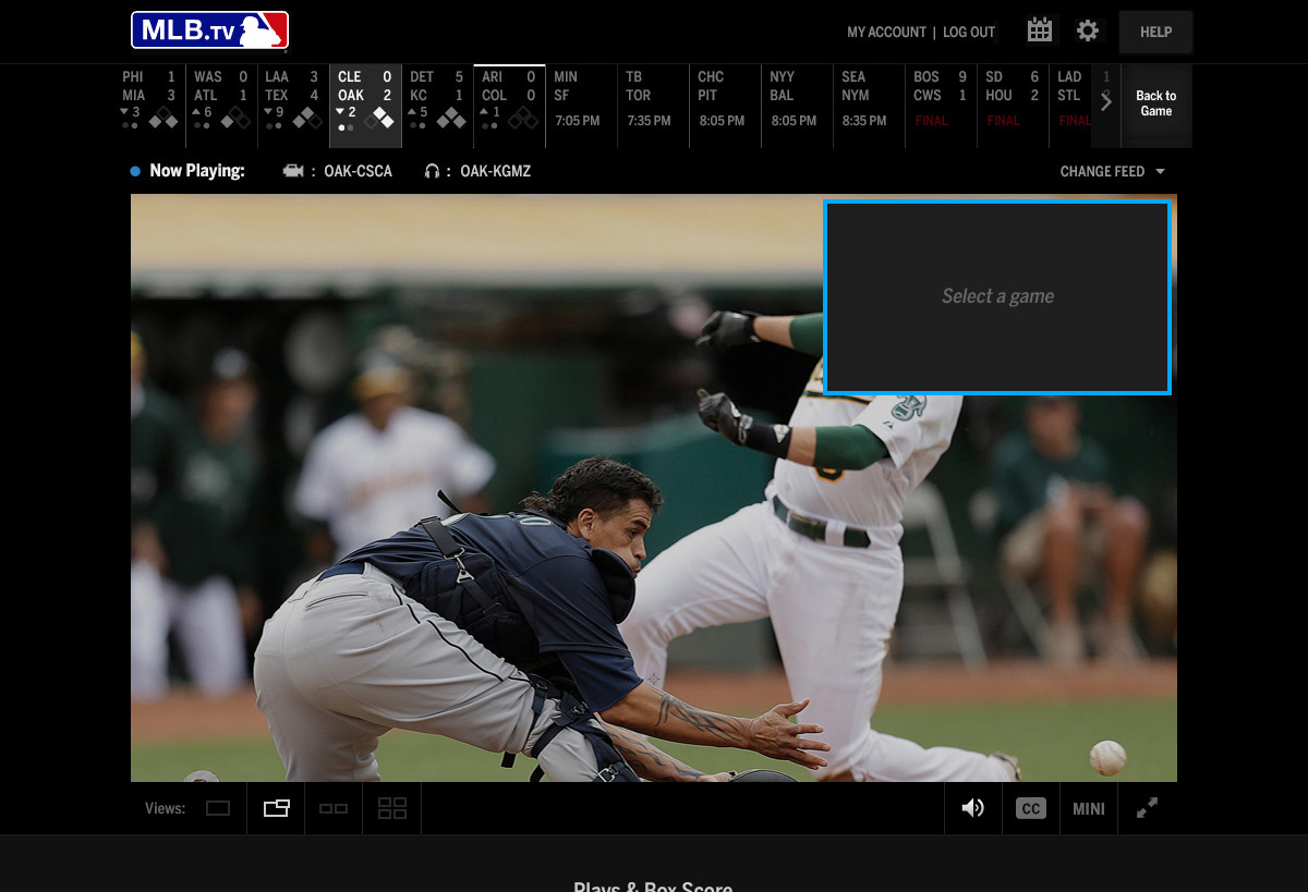
Another significant feature in MLB.tv is the ability to watch more than one game at a time which we call multiview. In multiview world a subscriber could watch anywhere up to 4 games at a time. Users can toggle between layouts like PiP, Dual, and Quad views. With the old player we found that the interactions was not descriptive enough to users to explain how they could change their broadcast. In addition the location of the controls did not support our research in terms of its prominence.
EXPLORATIONS/ITERATIONS
In order to solve this problem we looked at both the interaction and the position of the multi view controls. Should this feature be showcased as more of a walkthrough? Are users actually confused by the interactions in place or is it readily apparent what to do? Test users interactions with multiview. It was important for us to see.
The first option we tried was in two steps – a user would select views and views would take over the video screen focusing the users attention on their task (selecting a view) Once a view was selected, the user would see an active video slate with descriptive text and a right panel reiterating to the user what to do next. Another option we tried was to launch a user first into the side panel and let them choose the feed they want.
The last option was a small improvement over the last one but a crucial one – eliminate the extra steps and let the user pick their view first and then explain to them what to do next. Also add motion to indicate when focus should be paid.
The last option was a small improvement over the last one but a crucial one – eliminate the extra steps and let the user pick their view first and then explain to them what to do next.
GOAL 2
Improving Advertising Integration
One of the main business and sponsorship goals with the redesign was to boost ad revenue. Due to the ui constraints of the player sponsorship could only drive preroll advertising with a small companion ad above the video player. Since we were designing for a browser based player we had visible real estate to the left and right of the video player. Not only would this function as companion skins to pre roll which we could charge more for but it would allow us to skin free games allowing sponsorship to charge more for their sponsorship packages.
GOAL 3
Increasing user engagement with enhanced player features
Our core goals for the redesign of MLB.tv was to improve the feature engagment in the player. For us, this meant we needed to not only improve the UI of each feature but to add value to the user to increase use of each module.
FEATURE MODULE ORGANIZATION
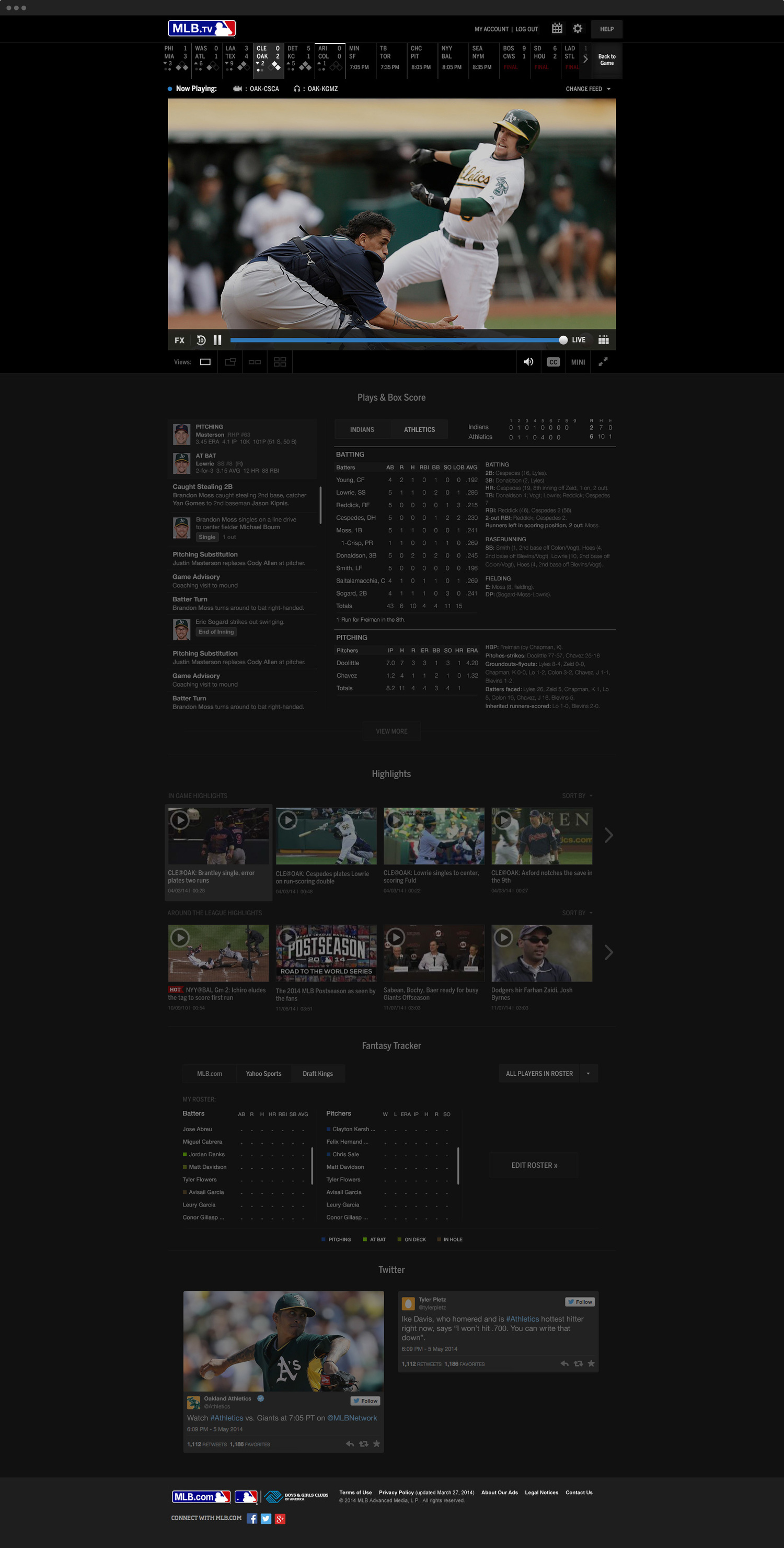
We wanted to approach the design of our features where we would not only show them in a more clear and friendly way but to allow fans to engage with their interests more directly. When looking into these features we had a couple different approaches.
In-Line Player Experience
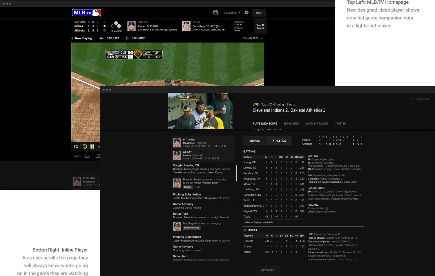
As seen above, we placed all the additional MLB.TV features below the video player in a new interface. These modules enhance the video experience providing users with Fantasy, Social, Highlights and Box Score. When designing for this new interface, something became very apparent, watching the game and looking at these features was disjointed. We needed to bring the video down to these features so we devised an in-line player which would dock to the top as a user scrolls down. This new mini player allows users to never lose their place in a game while exploring the games features.
MINI MODE
The In-Line player consists of the game video, the game score and a module navigation allowing users to jump to a specific module. The plays and box score module shows a play by play breakdown of what is happening in the game as well as a team box score and full game lineup. To conserve space, the module has a max height and View More button expanding that height.
HIGHLIGHTS
Highlights proved to work best with the In-Line player because it allowed users to watch highlights from this view without have to scroll back to the top of the page in the main video. If a user did wish to watch this in a bigger view, the highlight would appear as a Picture in Picture view. Additionally, while watching a highlight, we kept the game score of the main game a user is watching in view.
Interaction Design Guidelines
A new immersive baseball experience
Baseball stats, highlights, fantasy tracker and twitter feeds can allow a user to become fully immersed in the baseball experience by providing them with rich content in a simplified interface. For the new MLB.TV we took the content of the old media player, simplified the organization of information, cleaned up the interface and made each module user friendly.
Social Media Response
The public response to the new MLB.TV Media Player was overwhelmingly positive on social media. Of course, there was also plenty of feedback for improvements or technical issues. We took this feedback very seriously and we are attempting to resolve and add new functionality to continually improve the player.

